My Role

UX Design.
UI by Free Association, an agency in NYC.

The Client

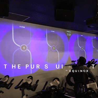
Equinox Fitness
A luxury fitness and lifestyle brand with 88 fitness clubs across the US, Canada and the UK.

Goals

Redesign the home screen and navigation of the iOS App: The company's most important and most used digital product.

Tasks

Competitive and comparitive research
Information architecture
Content Strategy
Wireframing
Interaction prototyping
User testing

Timeline

Approximately 10 months to first public release

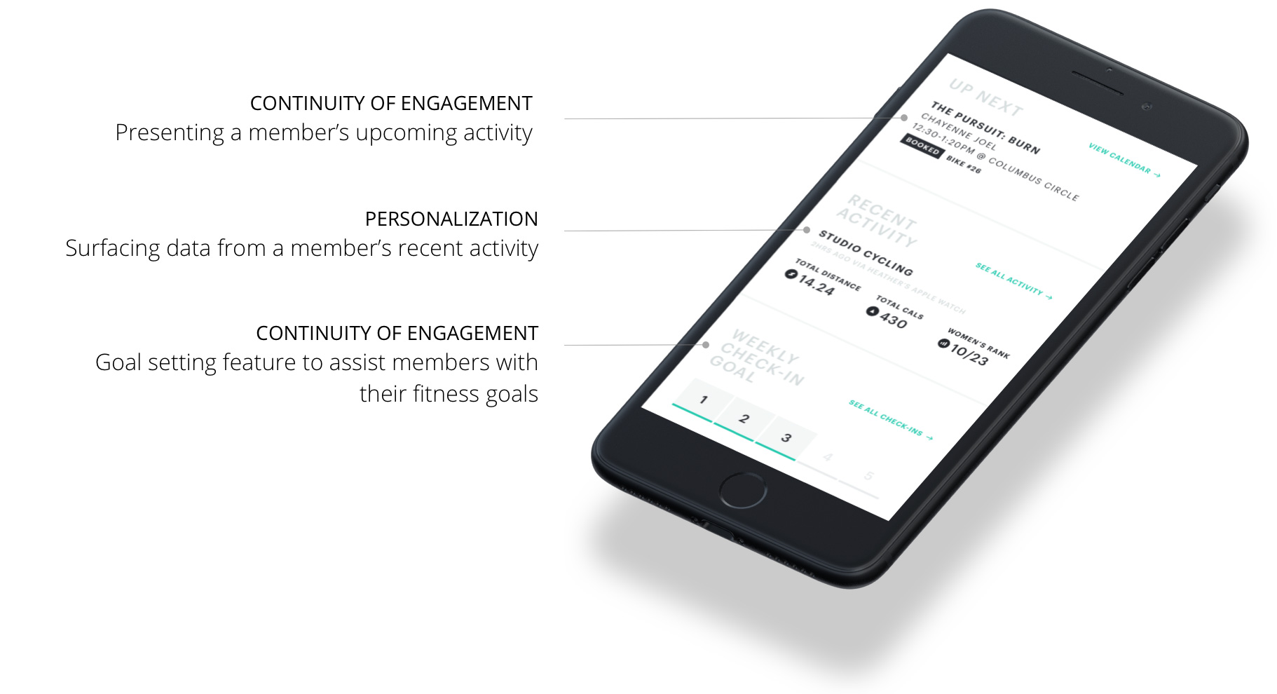
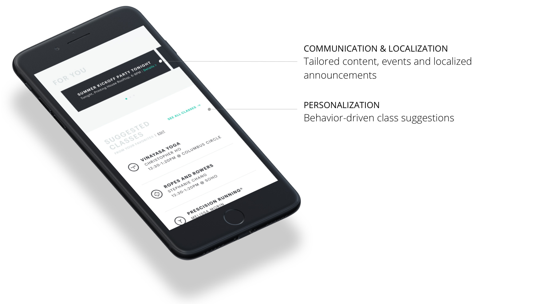
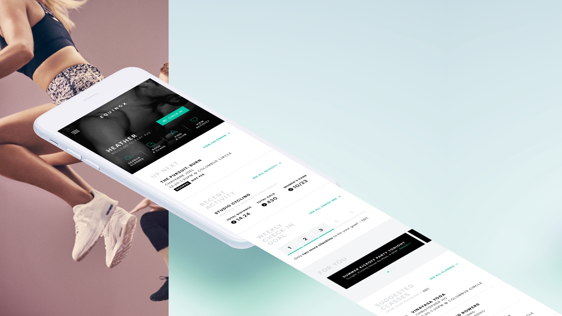
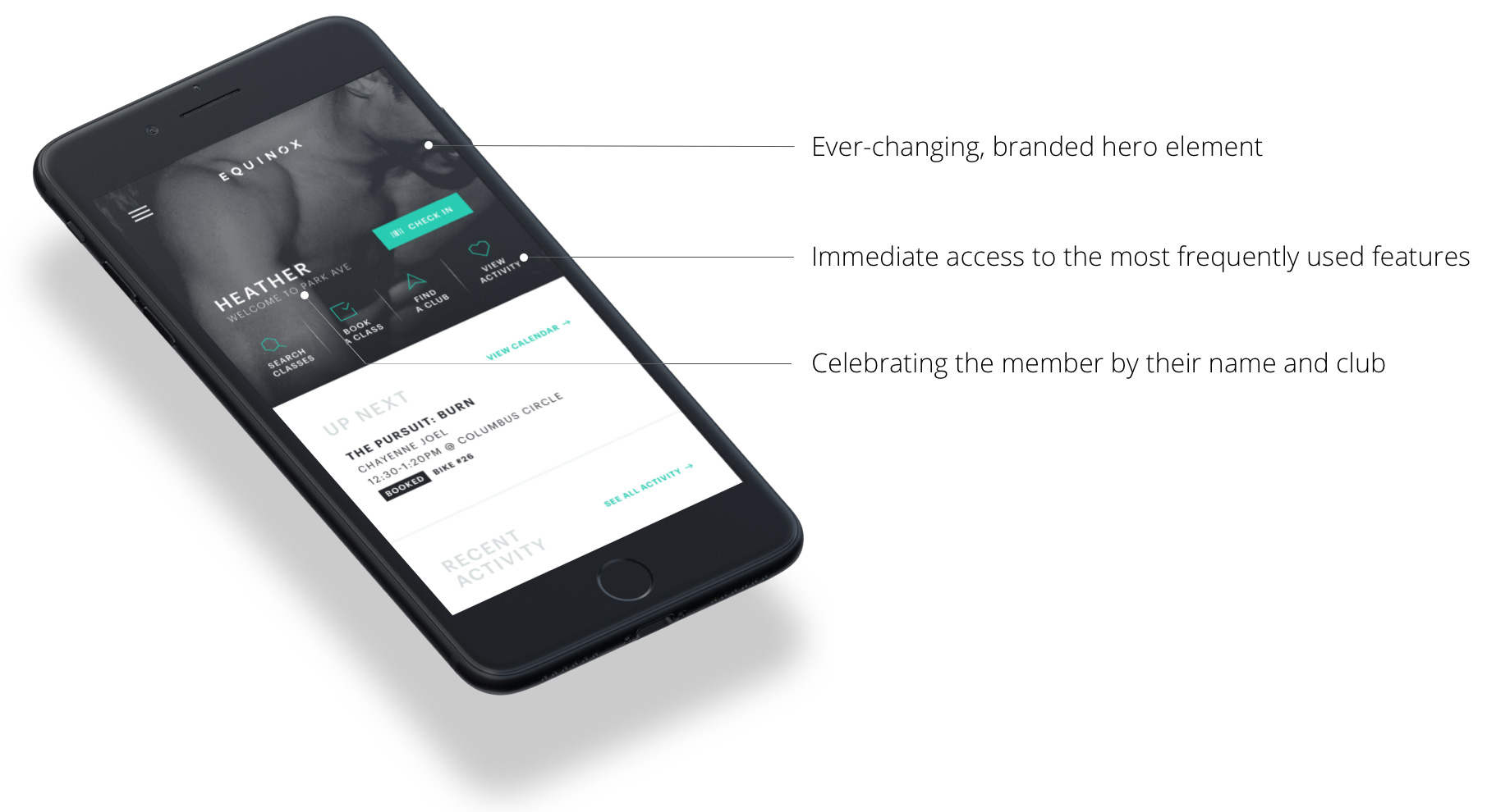
App Features Walkthrough
  • SEE THE PROCESS

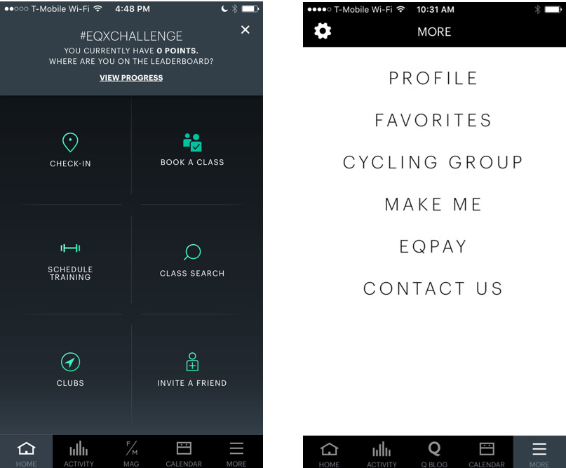
The App Before Redesign

Home screen and navigation


Key Challenges


The existing format of the home screen was utilitarian but made it nearly impossible to surface any new features or information to the members.

The app had grown, and continued to grow in features since inception. However value-rich sections of the app remained with low page visits.

The app had not had any major design overhauls since its launch in 2014.

The existing app had a consistent 4-star rating on the app store.

Understanding the Information Architecture

App Map

Cataloguing the entire application to understand the scope of features


Journey Map

What features are relevant where


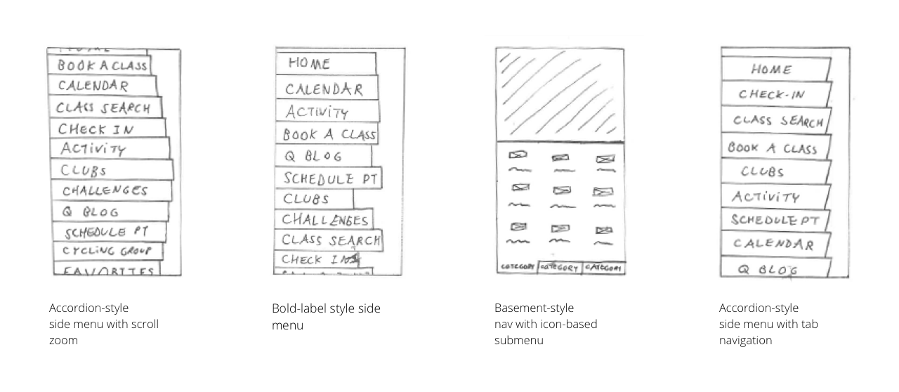
Ideation

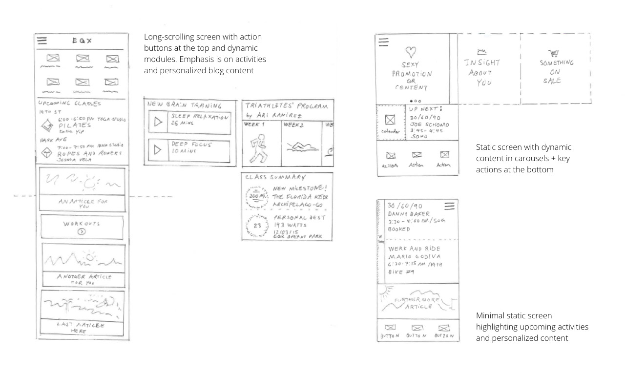
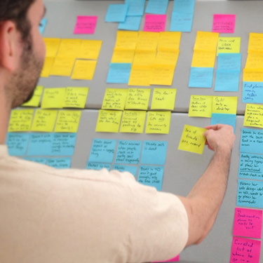
Sketching Ideas with the Design Team


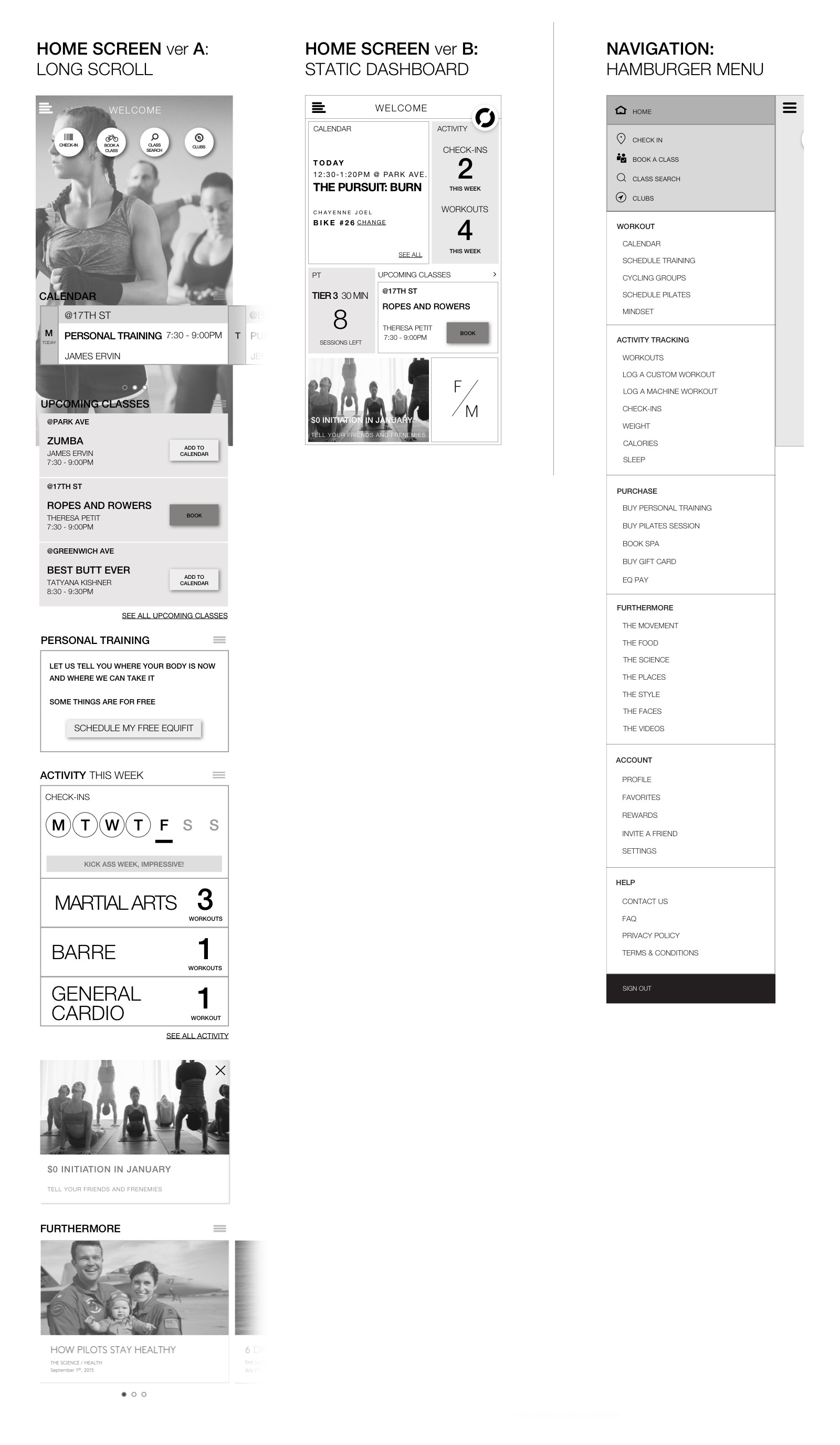
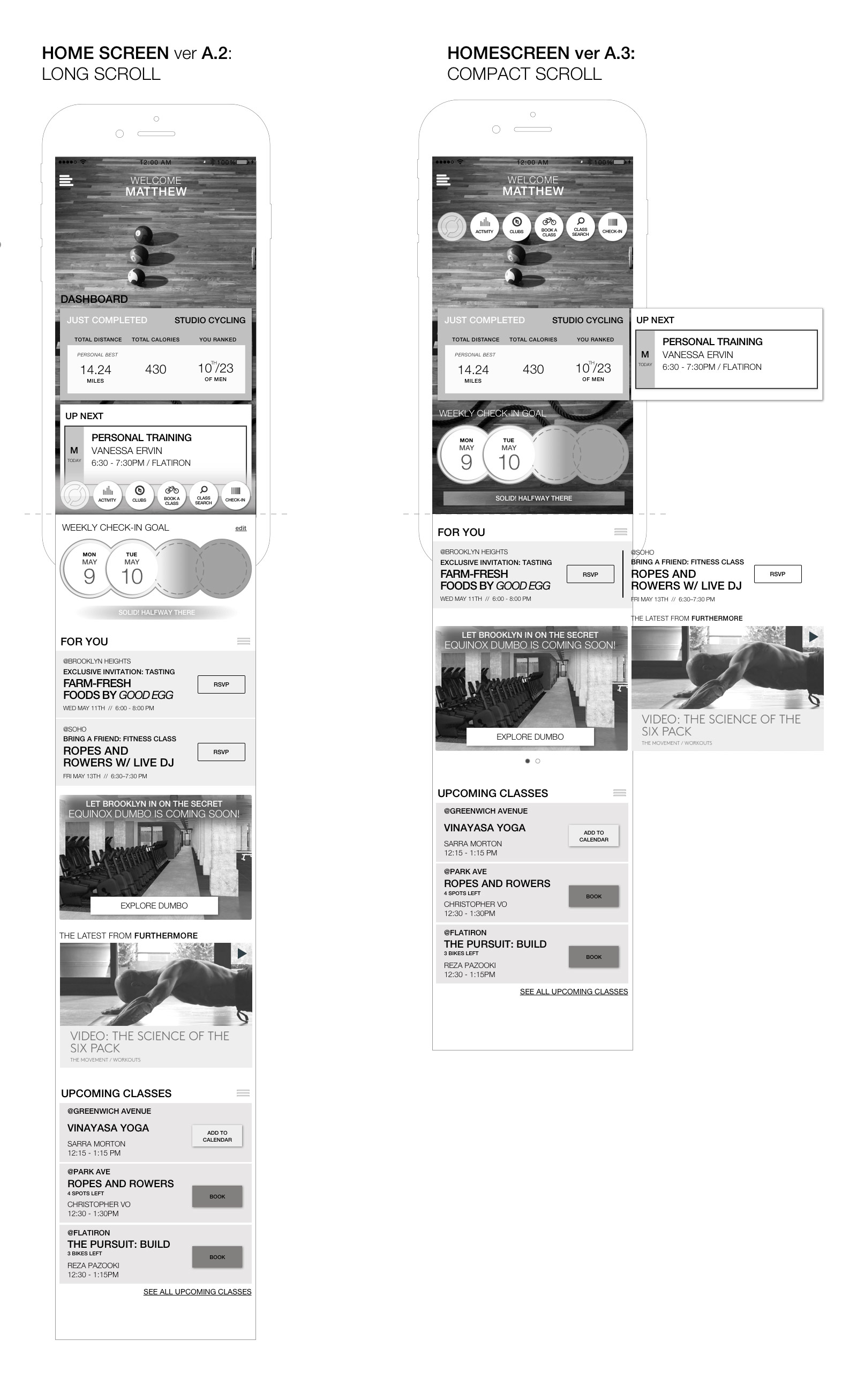
Wireframes & Prototypes

1st  Round of User Testing:   Two Versions of the Home Screen


2nd  Round of User Testing:   Two Versions of Home Screens

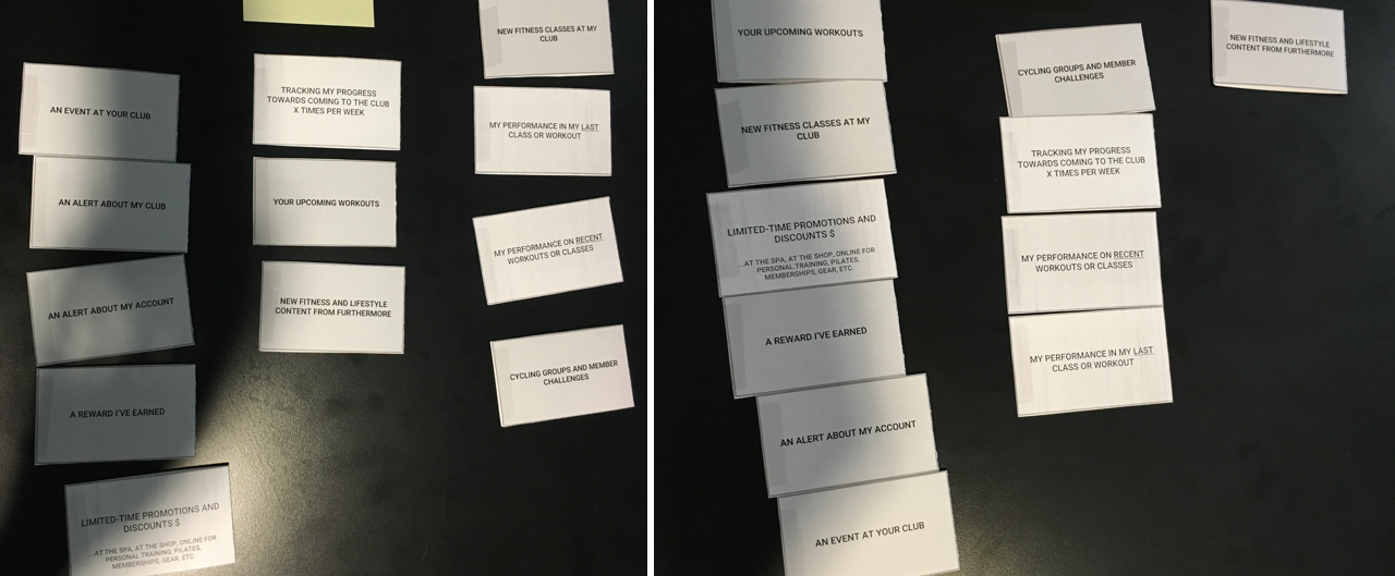
User Testing with Members

Interviews  \  Testing  \  Card Sorting  \  Recalling


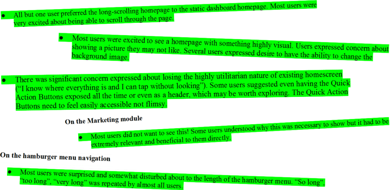
Samples from the user testing report


Results

☞   Expanded the platform to allow for personalized, localized content and messaging for members.


☞   Exposed new revenue generating channels for the company.


☞   Brought back the app to its 4+ star rating pre redesign, within a span of two months.